Wednesday, September 28, 2011

So I guess we aren't identical twins after all...

Minus a couple of details, I am quite pleased with my sisters new bedroom.

Here is a before(ish) picture: (ignore those two in the pic)


The seating of choice...was an exercise ball. An exercise ball. And it wasn't because anyone had back problems.


Oh, and don't mind that hooligan. Just a friend fooling around. A very funny friend I may add. But if you look behind her, and in the picture above, you can see the bright bright BRIGHT blue walls (picked out in, oh, sixth grade?) and the outdated papasan chair. Oh yes, and those hideous curtains. Some people like a lot of color all right next to each-other. 

I am not one of those people. Don't get me wrong- I love color. But I prefer it in different ways, like a pop of muted color here or there.  

Now I am going to totally contradict myself with this next photo that is so saturated with color it might blow your mind. Not really. But it is waaay far from the muted beige, browns, and pinks that I love.

Behold the new room:


Minus a couple of changes (like the frames being a couple inches too high off of the headboard- I hung them before the headboard arrived, and I guess my measurements were slightly off), I LOVE it. 

Now I just need to find a higher nightstand (there actually is a night stand on the left side, the same one from this post. It is just so short now that I have to figure out how to make it work. 

(Here's a bit of irony: the nightstand is lucite, so you are not "supposed" to see it anyways)

The paint color is Calypso Blue by Benjamin Moore (from their natura line- no VOC :)), the shams and headboard are from West Elm. the bedding, clock (upper left corner), and lamp (which is a desk lamp but I love it on top of a nightstand) are all from ikea, and the art is an amalgamation of stuff I found around the house, flea market finds, thrift-store spray-painted things, and even a DIY chalkboard that I placed into a $7 HomeGoods frame (instead of a picture). 

_______

...And now for something totally different. Both of these rooms were my idea... but they are definitely different.

Here is probably the worst "before" picture you've ever seen. But in my defense, I did this room re-do before I started blogging, so "before" pictures were not on my radar. 


Just take notice of the purple color on the walls. And those awful bookshelves, Actually, the color was a really pretty shade of purple, but I had grown out of it. I felt like going a pale blue was more serene and versatile. ( I chose Benjamin Moore's Beacon Gray- on the paint chip it looks gray but it has a definite blue tint in it- perfect for what I was looking for...and it was also from their Natura line- VOC Free!)


One thing I am planning on doing is moving those frames down and further apart. It looks a tad awkward right now.


So there you have it. My room and my twin sister's room. Just by looking at the rooms, you can probably tell things about our personalities. And maybe even that we are fraternal (not identical).

I love both rooms equally. But when it comes down to where I want to cuddle up and sleep at night, hands down, I pick the second room. My room.

Thank you for taking the time to read this. I hope you enjoyed reading it as much as I enjoyed writing about it- and actually doing it!
xxoo

Again, nothing could be more encouraging than any feedback. Any whatsoever. ANYTHING. Criticism is the bggest compliment. I'm totally open to criticism, but please make it constructive criticism. (If you are just going to say mean words, scroll your mouse to the corner of the window, and just click exit. Voila!)

Sunday, July 31, 2011

DIY Pinterest CHALLENGE


One of my most favorite blogs of all time is Young House Love. Last week Sherry from YHL, along with Katie Bower, Emily Henderson from HGTV, and Emily's friend Lana, decided to "challenge" all readers to DIY something from Pinterest. See the hilarious video here.

Luckily for me, I had an unlucky piece of furniture that could use a little TLC. Not that it was in horrible condition...but it wasn't exactly exciting...

Exhibit A:
A desk that was abandoned in the abyss of my basement (if you just thought "yay for alliteration! congrats, you're a nerd like me!). Anyways, the desk is an antique that is cute, but a bit bland. And not getting any use. I wanted to spice it up a little.

First- I considered sanding it by hand, and started to do so. After 15 minutes outside my fingers hurt and I had gotten no where. Onto plan b.

Plan B- I went to my neighborhood hardware store this morning and bought a $10 can of all purpose primer. It took me probably 10 minutes to coat the entire desk in primer.

Exhibit B:

You can see I took the drawer out to paint it. Already I thought the primer made it look ten times better.

Colors: I knew that I wanted to use turquoise, partly because I love the color, and partly because I already had a pint of turquoise paint from a leftover project. I also knew that I knew that I wanted to leave part of it white, being especially inspired by this "pin":


Now I know that desk doesn't have any white, but the simplicity of it is originally what made me think of my desk, and then I admired how the pop of color was subdued by the stained wooden top. But instead of just copying this desk, I wanted to do something different. And I love the combo of turquoise and white. Or anything and white. Or anything and turquoise, really.

After much contemplating what to paint white and what to paint turquoise, I made up my mind.
A couple hours of later (after sweating in my sports-bra and jean shorts- gotta love humid summers in the midwest) this little guy was born. Or reborn. Whichever.


The color is way more turquoise in person. Here's a close-up of the knob:


Overall, it was a fun project and I'm glad I did it. I don't really think I would have done something if the crazy ladies in the video above had brought up the idea.

Oh did I mention, I owned everything except for the primer? This was a $10 project. Not bad.

As for why I took the photos outside, it is really the only place I could get far away from the desk in a pretty background. (Take a photo in the garage? I don't think so). And someone else wanted to share the spotlight.


Farewell and happy blogging/reading/pinning...

Monday, June 20, 2011

My DIY belly shirt. And chair.

Today I made myself a belly shirt.


Oh, and I also took an old chair that looked like this:

And transformed it into this:

My mom bought the chair about 30 years ago, and upholstered it herself using the brown floral print.
No offense mom, but I wasn't to crazy about the floral print, but I love the chair, especially the woodwork on the back.
So I took an old dress that I never wear, because it fits me horribly (but I LOVE the print):
 ...and cut it up (my mom was horrified at this idea, but finally came around...I assured her that the chair would be used much more than the dress), and with the help of an upholstery gun that I found in the basement...voila:

This was literally the easiest task. Took me 10 minutes max.
Note: I am not actually planning on wearing that as a belly shirt. This is a joke. 

Sunday, June 19, 2011

Ikat

You know those friends who you hated when you first met them, but now you are practically in love with each other?

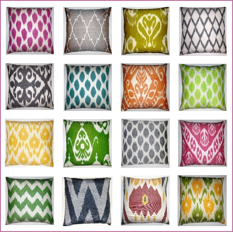
Well, my friends, that is my relationship with ikat. I used to hate it. I thought it looked like a "high-class" tye-dye. But it is much prettier than your Dad's 60's t-shirt or the shirt you dyed at your frenemie's 3rd birthday party.The colors blend together while still maintaing a geometric print. Ikat is an central asian way of dying each strand of thread individually, and then weaving them into beautiful patterns, for a tye-dye-ish effect.

For those of you not familiar, ikat prints come in any color and patterns:


Its all the rage now and is appearing everywhere- from shorts, to bedding, to dresses, to pillows.  Look at this gorgeous duvet cover:


If you could ever water color on a pillow, I'm pretty sure it would look something like ikat.

For more information on how ikat is made (its really interesting, and very labor-intensive) go to this site.

Have a Sparkling (water) Father's Day!

This morning my sister and I gave my Dad this super-cool future-esque carbonated water machine.


How sleek and contemporary does that look? Oh, and it is a totally appropriate gift for him consider he goes through one of these (a 12 pack):

in a single day. No more cans! Now we can all be eco-friendly, functional and stylish with our new soda machine!

Happy Father's Day to all the Dad's out there!

p.s.-  have to give credit to my Aunt and Uncle for the idea. They had one first. So technically, we copied off of you guys.

p.p.s. When we said Happy Father's day to him, he replied jokingly "I couldn't have done it without you."

My dad is a funny dude.

Friday, June 17, 2011

Layers from India

When I think of who inspires my style the most, no one has the impact of British-born designer India Hicks. She manages to create such an interesting, completely calming spaces. Her unpretentious yet classic style can be summed up into one word: layered.


From my (very) limited design experience, I find it most important to collect certain items, whether it be a lamp shade or an armoire that in some way speaks to you. I adore her collected, inherited, and bought items; isn't it so welcoming nostalgic? India has managed to make classic British design flow seamlessly with a breezy, beachy vibe.

My favorite part of the room? The built-in with all the straw hats. Functional, casual, and chic. (Note: this is most likely my favorite part because I am partial to a great straw hat.)

Oh, she also lives in Harbour Island year round (jealous much?).

She has her own blog http://www.indiahicks.com.

Wednesday, June 15, 2011

Life... a balancing act

Here I am painting my sis's room. It is Benjamin Moore's Calypso Blue. It is a pretty dark color, but her room gets a lot of natural light, so instead of being dreary, it comes off as a rich and deep color.

I C U

Or should I say, I CB2 you. Check out these awesome side tables from CB2. I'm using them in my sister's room for a chic, yet understated nightstand.

Pilot Post

SO, I have just quit my design internship.

Hmm. Something doesn't seem right here. A design lover like me would never pass up on an opportunity like that!

But, basically they were just making me organize closets and do their dishes. Oh, did I mention that one time two of them made me clean up a pile of sand that, um, they spilled. Yes. Sand. AKA the hardest thing to clean up EVER.

Anyways, this ending starts a new beginning....my blog! I have wanted to start a blog about my experience in design for so long. After all, I spend so much time reading design blogs, why not start my own?